Friday, 26 January 2018
Friday, 19 January 2018
Frequency distribution
In statistics, a frequency distribution is a table or graph that displays the frequency of various outcomes in a sample.[1] Each entry in the table contains the frequency or count of the occurrences of values within a particular group or interval, and in this way, the table summarizes the distribution of values in the sample.
frequency distribution shows us a summarized grouping of data divided into mutually exclusive classes and the number of occurrences in a class. It is a way of showing unorganized data e.g. to show results of an election, income of people for a certain region, sales of a product within a certain period, student loan amounts of graduates, etc. Some of the graphs that can be used with frequency distributions are histograms, line charts, bar charts and pie charts. Frequency distributions are used for both qualitative and quantitative data.
frequency distribution shows us a summarized grouping of data divided into mutually exclusive classes and the number of occurrences in a class. It is a way of showing unorganized data e.g. to show results of an election, income of people for a certain region, sales of a product within a certain period, student loan amounts of graduates, etc. Some of the graphs that can be used with frequency distributions are histograms, line charts, bar charts and pie charts. Frequency distributions are used for both qualitative and quantitative data.
Construction of frequency distributionsEdit
- Decide about the number of classes. Too many classes or too few classes might not reveal the basic shape of the data set, also it will be difficult to interpret such frequency distribution. The maximum number of classes may be determined by formula:
or
where n is the total number of observations in the data.
- Calculate the range of the data (Range = Max – Min) by finding minimum and maximum data value. Range will be used to determine the class interval or class width.
- Decide about width of the class denote by h and obtained by
.
Generally the class interval or class width is the same for all classes. The classes all taken together must cover at least the distance from the lowest value (minimum) in the data set up to the highest (maximum) value. Also note that equal class intervals are preferred in frequency distribution, while unequal class interval may be necessary in certain situations to avoid a large number of empty, or almost empty classes.[2]
- Decide the individual class limits and select a suitable starting point of the first class which is arbitrary, it may be less than or equal to the minimum value. Usually it is started before the minimum value in such a way that the midpoint (the average of lower and upper class limits of the first class) is properly placed.
- Take an observation and mark a vertical bar (|) for a class it belongs. A running tally is kept till the last observation.
- Find the frequencies, relative frequency, cumulative frequency etc. as required.
Histogram
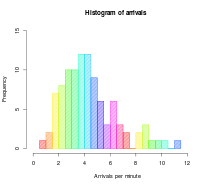
A histogram is an accurate representation of the distribution of numerical data. It is an estimate of the probability distribution of acontinuous variable (quantitative variable) and was first introduced by Karl Pearson.[1] It is a kind of bar graph. To construct a histogram, the first step is to "bin" the range of values—that is, divide the entire range of values into a series of intervals—and then count how many values fall into each interval. The bins are usually specified as consecutive, non-overlapping intervals of a variable. The bins (intervals) must be adjacent, and are often (but are not required to be) of equal size.[2]
| Histogram | |
|---|---|
 | |
| One of the Seven Basic Tools of Quality | |
| First described by | Karl Pearson |
| Purpose | To roughly assess the probability distribution of a given variable by depicting the frequencies of observations occurring in certain ranges of values. |
If the bins are of equal size, a rectangle is erected over the bin with height proportional to the frequency — the number of cases in each bin. A histogram may also be normalizedto display "relative" frequencies. It then shows the proportion of cases that fall into each of several categories, with the sum of the heights equaling 1.
However, bins need not be of equal width; in that case, the erected rectangle is defined to have its area proportional to the frequency of cases in the bin.[3] The vertical axis is then not the frequency but frequency density — the number of cases per unit of the variable on the horizontal axis. Examples of variable bin width are displayed on Census bureau data below.
As the adjacent bins leave no gaps, the rectangles of a histogram touch each other to indicate that the original variable is continuous.[4]
Histograms give a rough sense of the density of the underlying distribution of the data, and often for density estimation: estimating theprobability density function of the underlying variable. The total area of a histogram used for probability density is always normalized to 1. If the length of the intervals on the x-axis are all 1, then a histogram is identical to arelative frequency plot.
A histogram can be thought of as a simplistickernel density estimation, which uses a kernelto smooth frequencies over the bins. This yields a smoother probability density function, which will in general more accurately reflect distribution of the underlying variable. The density estimate could be plotted as an alternative to the histogram, and is usually drawn as a curve rather than a set of boxes.
Another alternative is the average shifted histogram,[5] which is fast to compute and gives a smooth curve estimate of the density without using kernels.
The histogram is one of the seven basic tools of quality control.[6]
Histograms are sometimes confused with bar charts. A histogram is used for continuous data, where the bins represent ranges of data, while a bar chart is a plot of categorical variables. Some authors recommend that bar charts have gaps between the rectangles to clarify the distinction.[citation needed]
History of pie chart
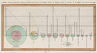
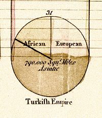
The earliest known pie chart is generally credited to William Playfair's Statistical Breviary of 1801, in which two such graphs are used.[1][2][9] Playfair presented an illustration, which contained a series of pie charts. One of those charts depicting the proportions of the Turkish Empire located inAsia, Europe and Africa before 1789. This invention was not widely used at first;[1]
| Early types of pie charts in the 19th century | ||||||||
|---|---|---|---|---|---|---|---|---|
|
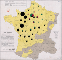
The French engineer Charles Joseph Minardwas one of the first to use pie charts in 1858, in particular in maps. Minard's map, 1858 used pie charts to represent the cattle sent from all around France for consumption inParis (1858).
Playfair thought that pie charts were in need of a third dimension to add additional information.[10] It has been said that Florence Nightingale invented it, though in fact she just popularised it and she was later assumed to have created it due to the obscurity of Playfair's creation.[11]
History of pi
History of pi
Pi has been known for nearly 4,000 years and was discovered by ancient Babylonians. A tablet from somewhere between 1900-1680 B.C. found pi to be 3.125. The ancient Egyptians were making similar discoveries, as evidenced by the Rhind Papyrus of 1650 B.C. In this document, the Egyptians calculated the area of a circle by a formula giving pi an approximate value of 3.1605. There is even a biblical verse where it appears pi was approximated:
And he made a molten sea, ten cubits from the one brim to the other: it was round all about, and his height was five cubits: and a line of thirty cubits did compass it about. — I Kings 7:23 (King James Version)

Pi is the 16th letter of the Greek alphabet.
Credit: Kathy GoldShutterstock
The first calculation of pi was carried out by Archimedes of Syracuse (287-212 B.C.). One of the greatest mathematicians of the world, Archimedes used the Pythagorean Theorem to find the areas of two polygons. Archimedes approximated the area of a circle based on the area of a regular polygon inscribed within the circle and the area of a regular polygon within which the circle was circumscribed. The polygons, as Archimedes mapped them, gave the upper and lower bounds for the area of a circle, and he approximated that pi is between 3 1/7 and 3 10/71.
Zu Chongzi of China (429-501) calculated pi to be 355/113, though how he arrived at this number is a mystery, as his work was lost. Pi began being symbolized by the pi symbol (π) in the 1706 by the British mathematician William Jones. Jones used 3.14159 as the calculation for pi.
Pi r squared
In basic mathematics, pi is used to find area and circumference of a circle. Pi is used to find area by multiplying the radius squared times pi, or. So in trying to find the area of a circle with a radius of 3 centimeters, π32 = 28.27 cm. Because circles are naturally occurring in nature, and are often used in other mathematical equations, pi is all around us and is constantly being used.
Pi has even trickled into the literary world. Pilish is a dialect of English in which the numbers of letters in successive words follow the digits of pi. Here's an example from "Not A Wake," by Mike Keith, the first book ever written completely in Pilish.
Pi
Pi (π), the 16th letter of the Greek alphabet, is used to represent the most widely known mathematical constant. By definition, pi is the ratio of the circumference of a circle to its diameter. In other words, pi equals the circumference divided by the diameter (π = c/d). Conversely, the circumference is equal to pi times the diameter (c = πd). No matter how large or small a circle is, pi will always work out to be the same number.
Pi is an irrational number, which means that it is a real number with nonrepeating decimal expansion. It cannot be represented by an integer ratio and goes on forever, otherwise known as an infinite decimal. There is no exact value, seeing as the number does not end. Many mathematicians and math fans are interested in calculating pi to as many digits as possible. The Guinness World Record for reciting the most digits of pi belongs to Lu Chao of China, who has recited pi to more than 67,000 decimal places. The Pi-Search Page website has calculated it (with the help of a computer program) to 200 million digits.
Value of pi
When starting off in math, students are introduced to pi as a value of 3.14 or 3.14159. Though it is an irrational number, some use rational expressions to estimate pi, like 22/7 of 333/106. These rational expressions are only accurate to a couple of decimal places, however.
Digits of pi
The first 100 digits of pi are:
3.14159 26535 89793 23846 26433 83279 50288 41971 69399 37510 58209 74944 59230 78164 06286 20899 86280 34825 34211 7067
Standard deviation
In statistics, the standard deviation (SD, also represented by the Greek letter sigma σ or the Latin letter s) is a measure that is used to quantify the amount of variation or dispersionof a set of data values.[1] A low standard deviation indicates that the data points tend to be close to the mean (also called the expected value) of the set, while a high standard deviation indicates that the data points are spread out over a wider range of values.
The standard deviation of a random variable,statistical population, data set, or probability distribution is the square root of its variance. It is algebraically simpler, though in practice less robust, than the average absolute deviation.[2][3] A useful property of the standard deviation is that, unlike the variance, it is expressed in the same units as the data. There are also other measures of deviation from the norm, including average absolute deviation, which provide different mathematical properties from standard deviation.[4]
In addition to expressing the variability of a population, the standard deviation is commonly used to measure confidence in statistical conclusions. For example, themargin of error in polling data is determined by calculating the expected standard deviation in the results if the same poll were to be conducted multiple times. This derivation of a standard deviation is often called the "standard error" of the estimate or "standard error of the mean" when referring to a mean. It is computed as the standard deviation of all the means that would be computed from that population if an infinite number of samples were drawn and a mean for each sample were computed. It is very important to note that the standard deviation of a population and the standard error of a statistic derived from that population (such as the mean) are quite different but related (related by the inverse of the square root of the number of observations). The reported margin of error of a poll is computed from the standard error of the mean (or alternatively from the product of the standard deviation of the population and the inverse of the square root of the sample size, which is the same thing) and is typically about twice the standard deviation—the half-width of a 95 percent confidence interval. In science, many researchers report the standard deviation of experimental data, and only effects that fall much farther than two standard deviations away from what would have been expected are considered statistically significant—normal random error or variation in the measurements is in this way distinguished from likely genuine effects or associations. The standard deviation is also important in finance, where the standard deviation on therate of return on an investment is a measure of the volatility of the investment.
When only a sample of data from a population is available, the term standard deviation of the sample or sample standard deviation can refer to either the above-mentioned quantity as applied to those data or to a modified quantity that is an unbiased estimate of thepopulation standard deviation (the standard deviation of the entire population).
Measures of dispersion
A measure of statistical dispersion is a nonnegative real number that is zero if all the data are the same and increases as the data become more diverse.
Most measures of dispersion have the sameunits as the quantity being measured. In other words, if the measurements are in metres or seconds, so is the measure of dispersion. Examples of dispersion measures include:
- Standard deviation
- Interquartile range (IQR)
- Range
- Mean absolute difference (also known as Gini mean absolute difference)
- Median absolute deviation (MAD)
- Average absolute deviation (or simply called average deviation)
- Distance standard deviation
These are frequently used (together withscale factors) as estimators of scale parameters, in which capacity they are calledestimates of scale. Robust measures of scaleare those unaffected by a small number ofoutliers, and include the IQR and MAD.
All the above measures of statistical dispersion have the useful property that they are location-invariant and linear in scale. This means that if a random variable X has a dispersion of SX then a linear transformationY = aX + b for real a and b should have dispersion SY = |a|SX, where |a| is the absolute value of a, that is, ignores a preceding negative sign –.
Other measures of dispersion aredimensionless. In other words, they have no units even if the variable itself has units. These include:
- Coefficient of variation
- Quartile coefficient of dispersion
- Relative mean difference, equal to twice theGini coefficient
- Entropy: While the entropy of a discrete variable is location-invariant and scale-independent, and therefore not a measure of dispersion in the above sense, the entropy of a continuous variable is location invariant and additive in scale: If Hz is the entropy of continuous variable z andy=ax+b, then Hy=Hx+log(a).
There are other measures of dispersion:
- Variance (the square of the standard deviation) – location-invariant but not linear in scale.
- Variance-to-mean ratio – mostly used forcount data when the term coefficient of dispersion is used and when this ratio isdimensionless, as count data are themselves dimensionless, not otherwise.
Some measures of dispersion have specialized purposes, among them the Allan variance and the Hadamard variance.
For categorical variables, it is less common to measure dispersion by a single number; seequalitative variation. One measure that does so is the discrete entropy.
Subscribe to:
Comments (Atom)


